Time Your Pixels: The Science of Matching Your Wallpaper to Your Body Clock

Photo: San Diego Air & Space Museum Archives, Public domain, via Wikimedia Commons
Most of us pick a wallpaper we like and stick with it for months — sometimes years. It looks good on day one, fades into the background by day three, and by week two you're basically staring through it like it doesn't exist. But what if that static image is doing more than just sitting there? What if it's actually nudging your brain in directions you didn't sign up for?
Turns out, it might be.
Researchers studying the intersection of environmental design and cognitive performance have started paying closer attention to how visual stimuli on screens affect alertness, stress levels, and focus. And while the wallpaper industry isn't exactly funding neuroscience labs, the underlying science of color psychology and circadian biology has some pretty direct things to say about what you should have on your screen — and when.
Your Brain Has a Schedule. Your Wallpaper Doesn't.
Circadian rhythms are your body's internal clock, regulating everything from cortisol production to core body temperature across a roughly 24-hour cycle. Light is the primary cue that keeps this clock calibrated. Blue-spectrum light signals alertness; warmer, amber-toned light signals wind-down. Your phone and monitor already exploit this with night mode features, shifting color temperature after sunset.
But here's the thing — the content of what you're looking at matters too, not just the color temperature of your screen hardware.
Dr. Mariana Figueiro, a prominent researcher in light and health at the Icahn School of Medicine at Mount Sinai, has published extensively on how visual environments shape biological arousal. While her work focuses primarily on architectural lighting, the principle extends naturally to the dominant visual anchor on your screen: your wallpaper. "The visual system doesn't cleanly separate 'functional' light from 'decorative' imagery," she's noted in broader discussions of environmental design. "It's all input."
Translate that to your desktop, and the implication is pretty clear: a stormy, dark abstract background at 9 a.m. is sending different neural signals than a crisp, high-contrast mountain ridge lit by morning sun.
The Morning Window: Cool, Clear, and High Contrast
Between roughly 7 and 11 a.m., most people are riding the early cortisol peak — the body's natural alertness boost that kicks in shortly after waking. This is prime focus time for a lot of us, and the last thing you want is a visual environment that fights it.
Color psychology research consistently links cool tones — think crisp blues, clear greens, and bright whites — with heightened alertness and sharper cognitive function. A 2009 study published in Science by Ravi Mehta and Rui Zhu found that blue environments enhanced performance on tasks requiring creative ideation and detail-oriented focus.
For wallpaper, this translates well to:
- Aerial ocean photography with clear turquoise water and visible depth
- Mountain or glacial landscapes with cool, high-contrast lighting
- Minimalist geometric designs in navy, slate, or icy white palettes
- Forest canopy shots taken on overcast mornings
The goal is visual clarity. Busy or warm-toned backgrounds during peak morning focus hours can subtly elevate visual noise at exactly the moment your brain is trying to zero in.
The Afternoon Dip: Where Warmth Actually Helps
Anyone who's worked a regular desk job knows the 2 to 3 p.m. slump is real. Biologically, it's tied to a natural dip in core body temperature and a secondary trough in the circadian alertness cycle. Caffeine helps. A short walk helps more. But your screen environment? That's something you can actually control without leaving your chair.
Warmer hues — burnt orange, terracotta, golden yellow, deep amber — have been linked in multiple studies to feelings of warmth, comfort, and mild stimulation. Unlike the sharp alertness of cool tones, warm colors tend to produce a more sustained, emotionally grounded kind of energy. Think less "espresso shot" and more "second wind."
Productivity researcher Chris Bailey, author of Hyperfocus, has written about the importance of managing mental energy rather than just time. Part of that management, he argues, involves shaping your immediate environment to support the kind of thinking you need at any given moment. Swapping out a stark, cold wallpaper for something with warmth and organic texture during the afternoon hours fits neatly into that framework.
Good afternoon wallpaper options:
- Desert landscapes at golden hour — think Utah, Arizona, New Mexico
- Warm-toned abstract art with earthy, analog textures
- Autumn foliage shots with rich reds, oranges, and deep golds
- Candlelit or firelit interiors for remote workers who need a cozy productivity nudge
Evening Screens: The Wind-Down Wallpaper
If you're working late or just browsing after hours, this is where a lot of people unknowingly sabotage their sleep. Blue-heavy, high-contrast wallpapers signal alertness to a brain that should be starting its melatonin ramp-up.
Evenning wallpapers should lean into muted, low-saturation tones. Think:
- Deep indigo or plum skies at dusk
- Soft bokeh photography with warm but diffused light
- Watercolor-style illustrations in dusty rose, sage, or mauve
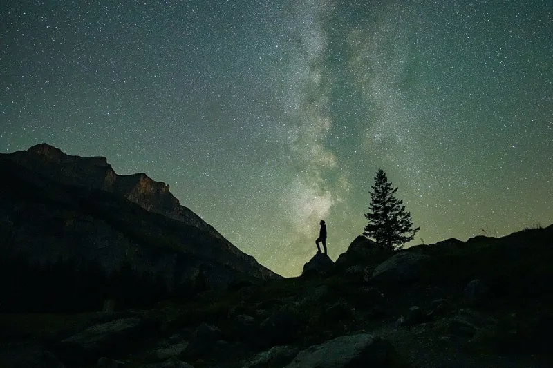
- Night sky photography without harsh artificial light sources
The principle here mirrors what sleep scientists recommend for bedroom lighting — dim, warm, and visually undemanding.
Building Your Rotation
The practical application is simpler than it sounds. Both macOS and Windows support scheduled wallpaper changes, and apps like Variety (Linux), Wallpaper Engine (Windows), and even basic Shortcuts automations on Mac can handle time-based switching automatically.
A simple three-phase rotation — cool and clear in the morning, warm and rich in the afternoon, muted and soft in the evening — gives your visual environment a rhythm that actually aligns with your biology rather than fighting it.
You don't need to overhaul your entire setup. Start with one swap. Try a cool-toned landscape wallpaper tomorrow morning and see if your first two hours feel any different. The research says there's a decent chance they will.
Your screen is already influencing your brain. Might as well make it work for you.