Preview vs. Reality: Why That Gorgeous Wallpaper Falls Apart on Your Actual Desktop
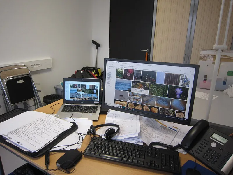
Photo: Openbiblio, CC0, via Wikimedia Commons
Every wallpaper site sells the same fantasy: a clean grid of perfect images, each one more stunning than the last. What that grid never shows you is the moment of truth — the instant your taskbar lands on it, six icons pile into the upper left corner, and the whole thing collapses into visual soup.
This is not a knock on wallpaper designers. It is a gap between two very different jobs. A gallery preview has one objective: look incredible in a small rectangle. Your desktop has a dozen objectives, and looking incredible is only one of them.
The Gallery Wants to Seduce You; Your Desktop Wants to Work
A thumbnail lives in a controlled environment. It is shown at a uniform aspect ratio, on a bright white page, next to nothing else competing for attention. Your desktop is the opposite: a variable crop, a variable size, variable lighting, and a permanent layer of clutter sitting on top of it.
That is why so many downloads disappoint. Nothing was wrong with the image. It just never met the conditions it was going to live in.
Five Reasons a Preview Lies
1. The Icon Collision Zone
Most operating systems pile desktop icons in the upper-left quadrant and dock the taskbar along the bottom or side. A wallpaper with a bright sun, a busy tree line, or a detailed focal point in those zones will lose. Every time. Look at a preview and mentally subtract the upper-left eighth of the frame — that is the part of your image nobody will ever truly see.
2. Crop Ratios Are a Silent Killer
A tall phone-shaped image stretched onto an ultrawide monitor is a funhouse mirror. A widescreen photo squeezed onto a vertical tablet display loses the entire point of its composition. Portrait and landscape wallpapers are different products, and the mildest crop can behead a mountain or push a horizon straight through the middle of your windows.
3. The Color Profile Gap
This one bites photographers hardest. An image graded in a wide-gamut color space can arrive on a standard sRGB panel looking flatter, duller, or faintly green. Your screen is also probably not calibrated, and the bright, punchy preview you approved on a phone at full brightness may read as washed out on a matte office monitor set to 40 percent.
4. Detail Density That Only Works at Small Scale
Busy patterns — foliage, crowds, intricate geometry — look rich in a thumbnail and loud at full bleed. Your eye has to do actual work to separate icon from image. The wallpaper is technically fine and functionally hostile.
5. Your Room Is Part of the Composition
Glare is the forgotten variable. A dark wallpaper behind a window-facing desk becomes a mirror by 2 p.m. A very light wallpaper picks up every smudge and reflection. The lighting in your space changes what the image can do, and no gallery preview has ever accounted for a west-facing apartment in July.
The Screenshot Test
Here is the cheapest quality filter available: set the wallpaper, take a screenshot of your actual desktop with all your actual icons and windows open, then look at the screenshot on your phone. If the background fights the screenshot, it will fight you.
This test catches nearly everything — the collision zone, the real crop, the color shift, the clutter. It takes ninety seconds and will save you from more bad downloads than any amount of scrolling.
A Checklist Before You Commit
- Match orientation and aspect ratio to your display first, style second.
- Check the corners. Icons live there. Keep them quiet.
- Preview at your real resolution, not the gallery's.
- Squint at it. If the whole image reads as one big texture, it is probably too busy.
- Look at it at night. Bright areas glow in dark rooms more than you expect.
- Confirm the download format. A heavily compressed JPEG will show banding in smooth skies and gradients on a large panel.
- Assume the crop is coming. Pick images with room to lose.
What the Good Ones Have in Common
Wallpapers that survive contact with a real desktop tend to share a few traits. Low-to-medium contrast in the middle. A clear subject placed off-center. Smooth gradients instead of sharp texture. Restrained saturation. And a sense of depth — foreground, middle ground, background — that gives your eye somewhere to rest instead of a continuous wall of information.
None of that is an accident. It is composition built for a canvas that has other things on it.
Sometimes Ugly Is the Right Answer
The wallpapers that look weakest in a gallery — the soft gradients, the near-solid colors, the boring abstract washes — are often the ones that survive longest on a working machine. They are not trying to win a contest. They are trying to stay out of the way.
So judge the next download accordingly. The question is not whether the wallpaper looks great in a grid. The question is whether it looks great with twenty icons on top of it, at 4 p.m., with the sun coming in sideways.